
Creamy.
Showing posts with label 關於圖片. Show all posts

教程 | 删除图片边框与影子


- Tutorial requested by R-kang -
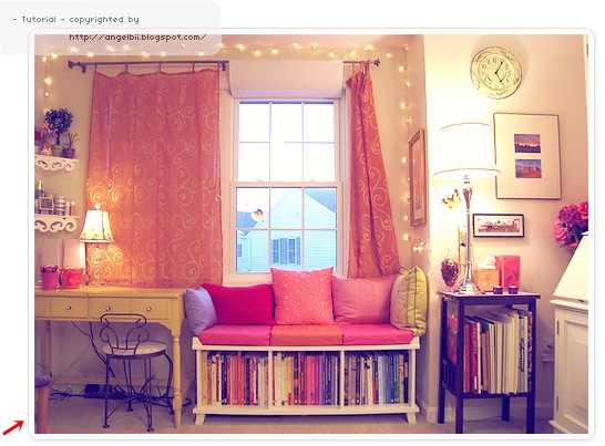
(Rkang, 抱歉哟、使用了你部落格的图片来做示例图)

1. 设计 → 修改 HTML

2. Ctrl + F 寻找代码 .post-body img, .post-body .tr-caption-container, .Profile img, .Image img,
.BlogList .item-thumbnail img {

3. 把 .post-body img, .post-body .tr-caption-container, .Profile img, .Image img,
.BlogList .item-thumbnail img { 里面的 box-shadow 代码删除掉:
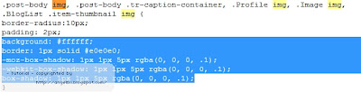

4. 预览看看有没有效果,即可保存。

注:你们也可以在这个代码里,添加你们想要的效果。


教程 | Miracle Image Hover (BT/BS)


- Tutorial requested by Cindy -

这是我之前设计的页面 navigator =]

Blog Template 使用者
1. 设计 → 页面元素 → 添加小工具 → HTML/JavaScript

2. 添加以下代码:
<style type="text/css">
.img-side{ 
background: #E8E6E6; 
color: #000;
width: 270px; 
height: 185px; 
margin-top:-185px;
opacity: 0; 
-webkit-transition:all .5s ease-in-out; }

.img-side:hover{
opacity:.7
}
</style>

<img src="图片网址" width="270" />
<div class="img-side"><br />
<center>
内容
</center>
</div>
3. 保存即可。


Blogskin 使用者
1. 模板 → 修改 HTML

2. 寻找代码 </style>,在 </style> 上面添加以下代码:
.img-side{
background: #E8E6E6;
color: #000;
width: 270px;
height: 185px;
margin-top:-185px;
opacity: 0;
-webkit-transition:all .5s ease-in-out; }
.img-side:hover{
opacity:.7
}
3. 之后,在你要添加小工具(此图片效果)的地方,添加以下代码:
<img src="图片网址" width="270" />
<div class="img-side"><br />
<center>
内容</center>
</div>
4. 预览看看,若没有问题,即可保存。

小解释
红色代码:hover 时背景的颜色(建议为灰色)
蓝色代码:字体的颜色(建议为黑色)
紫色代码:图片的网址
紫色代码:你要放的内容


教程 | 替部落格的图片添加形状


 - Tutorial requested by Yuen Thing & Angel -

↑ 就好像以上的图片一样,有形状的外形

1. 设计 → 修改 HTML

2. Ctrl + F 寻找代码 ]]></b:skin>

3. 在 ]]></b:skin> 上面添加以下代码:
img {
-moz-border-radius: 25px 10px / 10px 25px;
border-radius: 25px 10px / 10px 25px;
}
4. 保存前,先按 preview,看看代码有没有出错,即可保存。

Example A 
-moz-border-radius-bottomright: 50px;
border-bottom-right-radius: 50px;


Example B 
-moz-border-radius-bottomright: 50px 25px;
border-bottom-right-radius: 50px 25px;


Example C
-moz-border-radius-bottomright: 25px 50px;
border-bottom-right-radius: 25px 50px;


Example D 
-moz-border-radius: 1em 4em 1em 4em;
border-radius: 1em 4em 1em 4em;


Example E 
-moz-border-radius: 25px 10px / 10px 25px;
border-radius: 25px 10px / 10px 25px;


Example F 
-moz-border-radius: 35px;
border-radius: 35px;


教程 | 将图片的边变成圆角


- Tutorial requested by Michelle -


教程 ① 图片直接呈现圆角状态

1. 设计 → 修改 HTML

2. 寻找代码 ]]></b:skin>

3. 在 ]]></b:skin> 的上面添加以下代码:
img{
-moz-border-radius: 30px;
border-radius: 30px;
}
如果、如果,你的 ]]></b:skin> 上面已经有了 img{ ,你只要直接把以下代码加进去 {...} 之间就好了:

-moz-border-radius: 30px;
border-radius: 30px;
 4. 加了代码之后,按 preview 看看效果有没有出来,保存 即可。

教程 ② 鼠标经过时,图片呈圆角状态

* 这个教程就是说,当 cursor 经过图片的时候,你的图片会变成圆角形状了。

1. 设计 → 修改 HTML

2. 寻找代码 ]]></b:skin>

3. 在 ]]></b:skin> 的上面添加以下代码:
img:hover{
-webkit-transition-duration: 0.5s;
-moz-border-radius: 30px;
border-radius: 30px;
}
小解释
红色代码:圆角的弧度(可随意更改)
蓝色代码:图片转换成圆角形的时间(就慢动作的时间啦,可更改)


教程 | 删除图片链接


- Tutorial requested by Yan -

1. 新建帖子 → 上传图片

2. 按着图片(蓝色的),然后在 『Link』那边按一下(取消图片的链接)

↓ 下图所示


3. 完成你的帖子,按 发布。然后去你的部落格看看你的图片还能使用 right click 来 save 嘛。